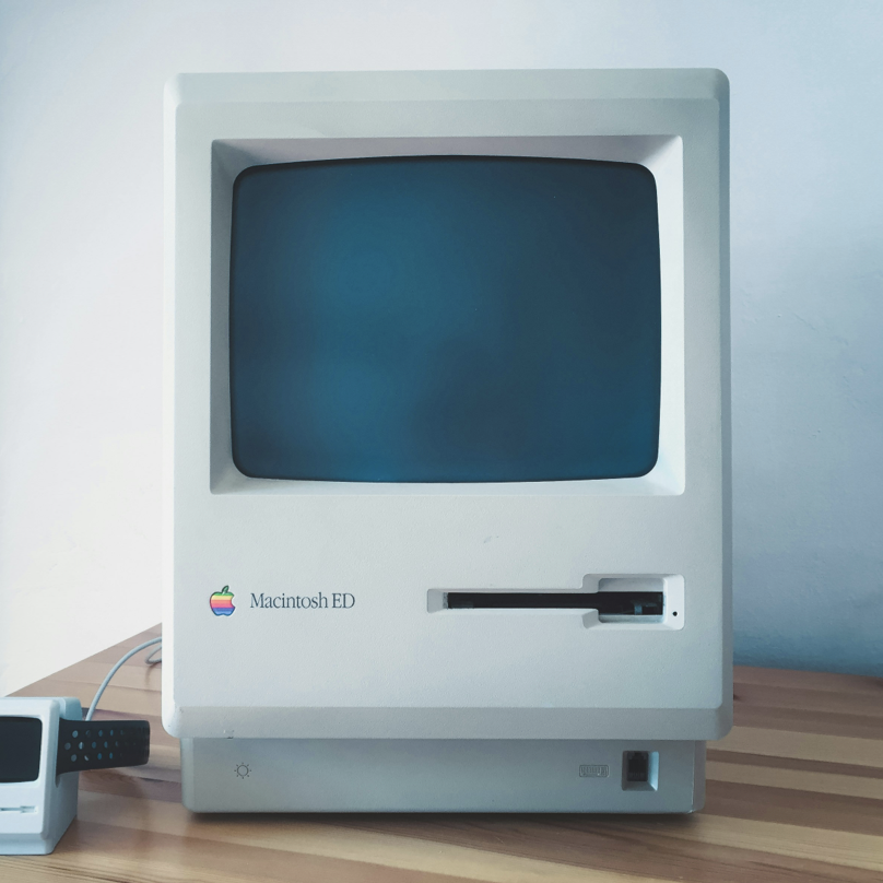
An old Macintosh computer.
New Blog
It was a long and dusty road to get to this point. I had a balance of 0.94 cents on the prepaid cash card attached to my digital ocean account. I had been racking up my balance doing some client work. The “Unsuccessful charge” emails had starting coming in daily. Inbox zero was a distant dream. And then… An email saying that everything was deleted. My entire account, wiped. bummer. Almost 10 years of blog posts gone. No backups.
What a relief.
Starting over new, and fresh, and shiny, seems like a lot of fun. Keeping things simple also seems like a lot of fun. My last website ran on Ghost, which is fine. It’s good. It’s Great. But there were drawbacks. Like the necessity to have a runtime to get it to… Run. Every attempt I had to make a dynamic experience that required a server with log ins, and a web editor, failed. It was a pile of unnecessary. There’s nothing dynamic here. I can write HTML and CSS myself I don’t need a server. I don’t need logins
I hope to have a server that needs all that again. Truly, But ever since going freelance again I’ve been making more websites in less time than I ever have. Piles and Piles of HTML and CSS. I’ve got these muscles loosey goosey. I’m Dialed in. Focusing on my craft.
Design inspirations
I ripped off the feeling of this blog from A nike design book and the old Nasa style guide from the sixties. There’s something fresh and clean about a san serif typeface that looks a little too much like Helvetica. The typeface is General Sans, a favorite of mine. It’s clean, bold, and has a punch of personality. Most importantly it’s a bit weightier in the mid weights just like I like it. I’m not fond of a medium or regular font weight that feels too light. Give me meat on them bezier curves.
Development Credo
I wanted to challenge myself a little, and also actually ship a project quickly, so I followed a few rules.
- Very simple layout only.
- No fancy styles.
- Use the same base typography settings for everything.
- Images optional.
I also decided to Use Jekyll. I gutted it, and dropped my stuff right on into the joint. Works great. Also works with RSS too. I actually wanted to use Camping, but it’s not ready yet. But that will change this summer. It’s been moving along at a steady pace, needs some database love, and a some deployment love, and it’s golden.
To fulfill these development requirements the design also had to be more streamlined and focused. I went with a two column layout, split down the middle. Everything is split on that axis. Narrow screen sizes are just stacked vertically. You know, the classics.
Repurposing typography decisions and only minimally making some changes. This means that Blog post previews, the little cards, only require a few styles to get it to behave like a card. The text just works inside because I did a good job. Only two Heading types are used to keep it simple too. h1, h2, that’s it. A couple of page headings get some love to adjust their top margins in certain contexts, like on the home page.
Instead of having special layouts for each page, I make a layout context using CSS Grid. Then setting that on a container by using a custom attribute:
main[layout="home"] {
  display:grid;
  grid-template-columns:1fr 1fr;
  grid-template-rows: auto;
  grid-template-areas: "left right";

  column-gap: var(--space-l);
  row-gap: 0;
}
<main layout="home" aria-label="Content">
{{ content }}
</main>This makes a two column grid with equal width for both sides. I put it in a vertical column when things get too small:
@media (max-width: 800px) {
  main[layout="home"] {
    grid-template-columns:1fr;
    grid-template-areas: "left left" "right right";
    row-gap: var(--space-l);
  }
}
I’ve tried to push things to be incredibly simple, with a little style on this build. I think I’ve achieved it. I hit all my goals. Looks nice, Shipped fast, Nothing broken.
All in all it turned out alright.
-kow
